You know that old saying: "don't judge a book by its cover," well I have always tended to be leery of that. I always seem to judge a book by its cover. I feel most people do. I mean, it is the first thing you see when picking up a book. For myself, if the cover is not interesting I usually don't give it the time of day. Harsh? Maybe so, but it is the truth.
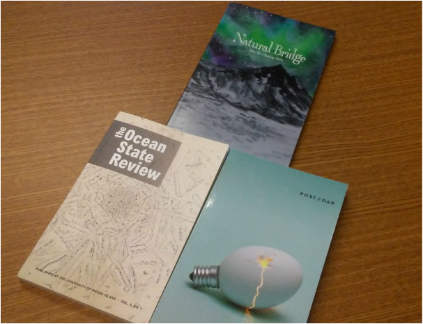
With that idea in our minds, let us discuss and dive into the idea of book covers. Cover design is what Toyon is going to discuss in its next meeting. In the image above, there are three different literary magazine covers I have chosen from our Toyon room that I find pleasing. The Natural Bridge has a cover design that I really enjoy. It has bright colors that grab my attention. When I took a closer look at the cover, I realized that the image is in fact a painting! That made me enjoy the cover even more. Next, the Postroad has a cover of a cracked light bulb which is actually an egg--interesting. This cover makes me wonder what this image is trying to communicate with its viewers. The image also makes me wonder what kind of work lies inside the journal. Lastly, we have the Ocean State Review. This cover is the most simple cover out of the three. Simplicity is something that can be super effective. This is the case for this cover design. The title is large and clear and I am not overwhelmed by confusing images that can sometimes make me stray away from certain books. I really enjoy the cover because of the swirling of musical notes. Music is my second nature, so I picked up this book pretty fast.
I also did a little research on cover designs and found a few interesting tips that I would like to share. Writers digest has "10 Tips for effective book covers." There were a few tips they suggested that I agreed with. I feel the best tip was "the title should be big and easy to read." This is why I really liked the Ocean State Review's cover. This cover had the largest title and it caught my eye. I didn't have to look around for the title, it was right there. The next tip is "avoid garish color combinations." I had to look up the word "garish" and it was what I thought it was: overly vivid, bright colors. Think of the disco. Yeah, colors like that on a book may scare me away from even picking it up.
With all that said, it will be a fun process to start discussing and choosing a cover for Toyon! We are meeting with a cover designer, so his opinions and ideas should be really informing to us all.
October 26, 2016
